Make Sure Your Projects Are within Time and Budget Constraints with Dashboard
Dashboard as a powerful instrument of Epicflow multi-project management software provides an overview of all projects from the micro to the macro level. It shows your projects’
- statuses, priorities;
- budgets; as well as
- tasks, summaries, and milestones.
Dashboard is essential for your company if you run multiple projects in parallel and have to keep every project under control based on historical and real-time data.
Explore the State of Your Projects from Different Angles with the Project Performance Tab
The Performance Tab is a handy way to analyze the progress of all your active projects from different perspectives. All project data is presented with diagrams.
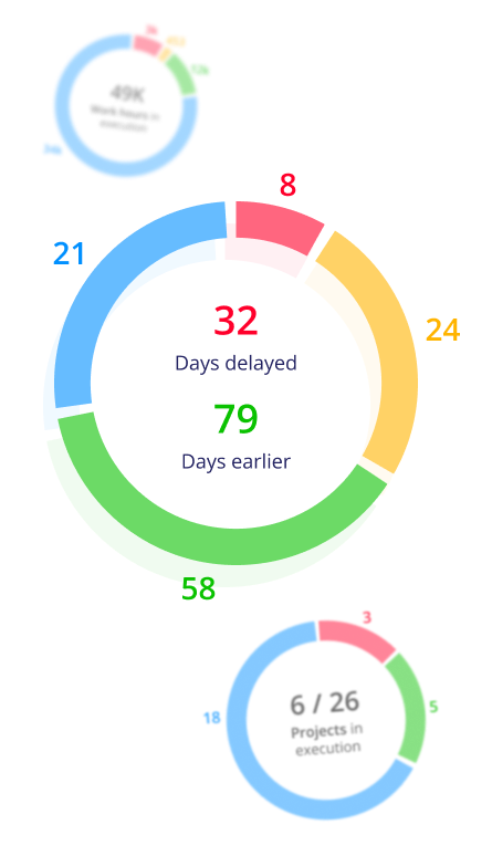
Check your projects’ statuses:
- The number of projects in execution vs. the total number of projects in the Pipeline.
- The number of projects in red, yellow, green, and blue.
- See the number of work hours in execution, including the number of red, yellow, green, and blue hours.
You can display the data by
- the project priority,
- the business value.
- Examine the expected due date performance in % and in days:
- Get information about the number of projects that are going to be delivered on time vs. the total number of projects in the Pipeline and their categorization according to their statuses (colors).
See how many days earlier or later your projects are expected to be delivered based on the data analysis results.
The data here can be shown by
- the planned due date,
- the baseline due date,
- the business value.
Bubble Graph: Time-Honored Fever Chart in a New Format
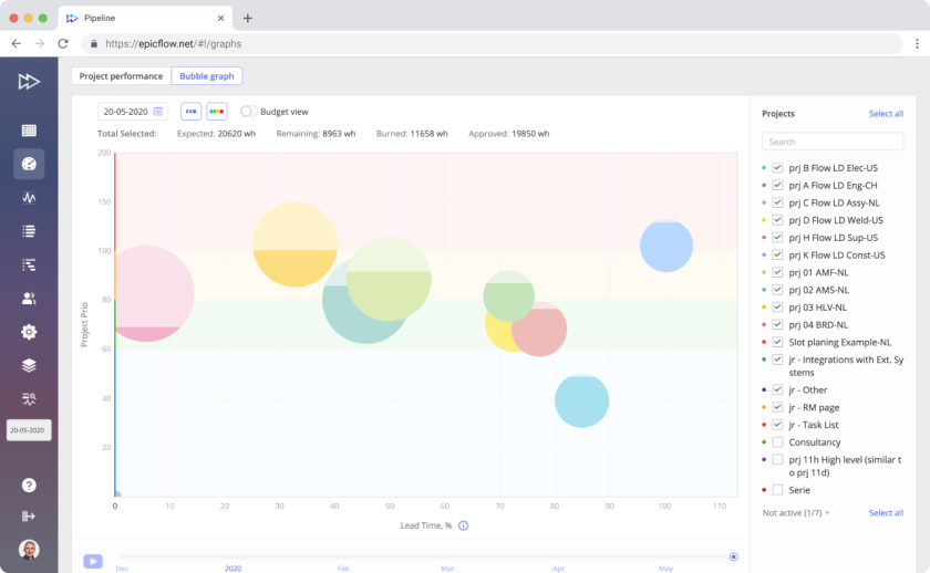
A Bubble graph is a modern version of a Fever chart – a graph used in Critical Chain Project Management (CCPM) from the Theory of Constraints (TOC). It is visualized with three colors (green, yellow, and red) to display a project’s progress over time against buffer time and existing constraints. To adapt the graph to a multi-project environment and make it more clear, we use bubbles to show projects on the graph.
The main purpose of the Bubble graph is to visualize the project flow with regard to the due date and make management focus on the projects that need special attention.
Let Your Projects Be within Time and Budget Frames with Project and Budget Views
You can switch between two views on the Bubble graph:
- The project view shows if you’re in terms of your schedule regarding buffer time (time constraints). Check accurate real-time information about the project priority, its progress, and the amount of work in work hours according to its priority (colored with blue/green/yellow/red) in the Project View.
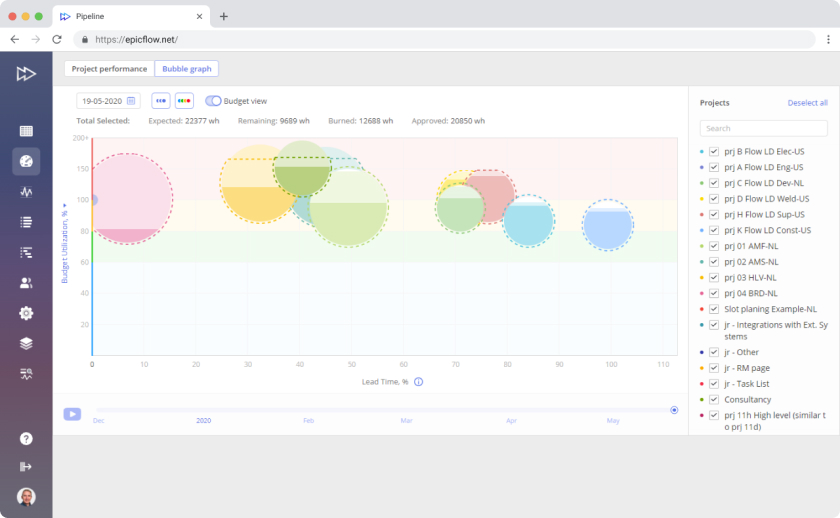
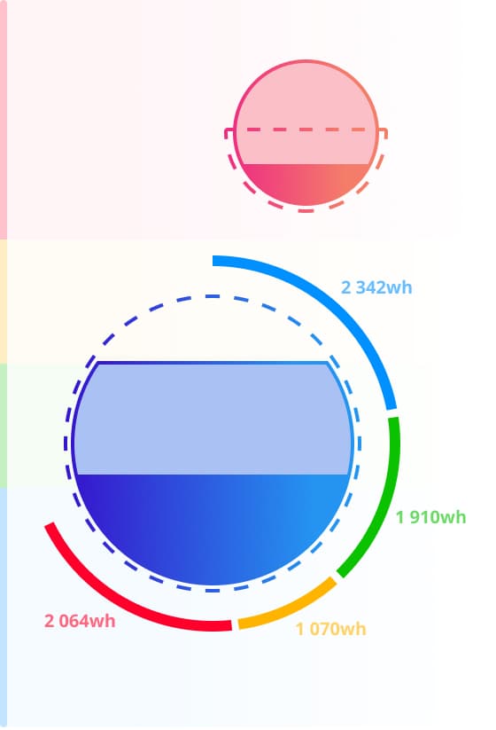
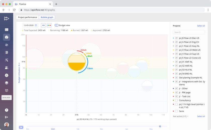
- The budget view demonstrates whether you’re within the limits of the scheduled budget (budget constraints). In the Budget View, a dashed line shows the approved budget (buffer) in work hours. If the line is over a bubble, you have some buffer. If it’s around a bubble, no buffer is available. If the line is inside a bubble, you’re using more than approved.
Bubble Graph Structure:
Know Everything About Helpful Tools
Bubbles
Projects are visualized as bubbles of different colors. This makes it easier and more comfortable to differentiate them. Bubbles also differ by size depending on the scheduled number of work hours necessary to complete the project, which in turn, depends on the number of tasks and their complexity. The dark color within a bubble is the work performed, and the light one is the amount of work that is left.
Axes
- In Project View, the vertical axis displays project priority from 0 to 200. The horizontal axis shows lead time in % from 0 to 100.
- In Budget View, the vertical axis shows budget utilization in %, and the horizontal one presents lead time from 0 to 100%.
Colors
You can see four colors on the graph: blue, green, yellow, and red.
- Green means you have no threats, and everything is performed according to the schedule.
- Blue means that you have too much buffer, and you should decrease your lead time.
- The yellow color is cautionary: it warns about possible threats. When you see it on the Bubble graph, analyze the environment and take measures to move the bubbles to the green area.
- The red area is critical. It means your progress is in trouble, and you have to take some urgent measures to fix this.
Interpreting the Bubble Graph:
Make Your Analysis as Efficient as Possible
- The Y-axis shows project priorities. The higher the bubble (project), the higher the priority. The X-axis is lead time. The farther the project is to the right, the closer the deadline.
- If the priority is higher than 100, the project has no buffer. The number above 100 is the number of days the project is late.
- In the row above the chart, you can check the number of total expected, remaining, spent (burned), and approved work hours. The difference between the expected and approved hours is the amount of buffer you have.
- Around the bubble, you can see the amount of remaining work in work hours and the colors of project tasks according to their priorities.
- The dashed line above the circle means that the project is within the budget and has some buffer. If the dashed line is lower, the project is over the budget.
Analyze Your Project Environment Over Time
You can choose any period and enable the Playback option. You’ll see the bubbles moving through the Dashboard, changing by size and color, and the colored areas on the graph based on historical data from the selected date up to the current moment. Here you can also choose either a project or a budget view.
Summary: Bubble Graph’s Capabilities and Why Use It
- Bubble graph is dynamic, which makes it more convenient as compared to Fever Chart. You can watch the bubbles moving through the graph field when switching the playback option to see your projects’ flow in a certain period in the past up to the current date.
- Get all project-related data on the Bubble graph by clicking on a project.
- Zoom in from micro to macro levels to see the necessary details (from project to tasks).
- Check detailed information about the amount of work you have to do to improve the critical state of your projects.
- Go from a project to the task level to examine which constraints your projects are facing.
- Control the consumption of your time and budget buffers.
If you already have a project or resource management solution but would like to use Bubble graph for efficient project management, you can integrate your software with Epicflow (at that, ready-made integrations with Jira, MS Project, and Oracle Primavera are available).
