How to Be on the Ball with Long-Term Planning and Current Fires
 Alexandra Gutsol
.
June 14, 2026
.
Leadership
.
8 mins READ
Alexandra Gutsol
.
June 14, 2026
.
Leadership
.
8 mins READ

Running many project initiatives in parallel remains part of the C-level dilemma according to Wellingtone’s project management report. It’s becoming more difficult for executives to meet strategic goals. Heightened market volatility and rapid change make it difficult to assume what’s going to happen months, weeks, or even days in the future. The biggest challenge facing CEOs is that they can’t see the bigger picture and can’t bridge the gap between strategies and results. They end up not knowing how to follow the initially planned budget and their financial situation ends up being far from clear.
How to be on the ball with long-term planning and fight current fires — that’s the challenge that business leaders face (you might be one of them). From our experience, that’s precisely why senior managers turn to us: to help them convert management targets into actions and get real-time information to take business decisions.
Get a High-Level Overview
Being a good strategist relies on a CEO’s ability to make critical decisions at the right time and deal with their consequences to ensure that the business strategy meets expectations of employees and shareholders. But how is that possible without having a clear bird’s-eye view of how projects are developing over time?
Realizing that business leaders still lack control and a holistic overview of their multiple business initiatives from a single place, we upgraded Epicflow’s web-based tool for multi-project management with a new feature, the Bubble Graph. The purpose of the Bubble Graph is to give a high-level overview of ongoing projects.
Epicflow’s Bubble Graph shows C-levels the projects they should definitely concentrate on and the things that don’t demand their attention right now. In the screen below we can see a project needs your attention right now because he's already delayed. We discuss the next steps you can take to improve this situation further in the article.
Figure 1. Epicflow’s Bubble Graph
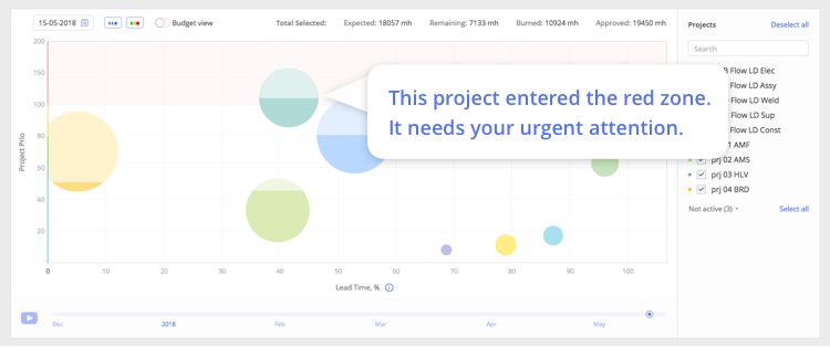
On the X-axis, you can see the project data based on the lead time. The lead time indicates how much time has passed between a project start date and end date. In turn, the Y-axis shows the project priority. Number 100 on the Y-axis means that one of the milestones has already exhausted its buffer and it can cause a delay of the entire project. The red project zone starts with Priority 100. The value of 101 means that the project is already late for one day.
The Bubble Graph visualizes the progress of project flow by means of bubbles that are filled automatically as long as tasks get accomplished and milestones are reached. The graph neatly displays projects of different sizes based on lead time and project priority. The size of the bubble stands for the size of the projects with man hours as its measurement units. The saturated part in the bottom of the bubble indicates hours burned, while the upper part shows hours remained. As you could have probably noticed, the Bubble Graph functions based on historical data and it’s possible to check project progress at a specific time point in the past.
Monitor Project Portfolio Trends to Reduce Distractions
CEOs are exposed to noise that comes directly from the workplace. They’re constantly approached by employees who want to be involved and pull the business in a certain direction. But it’s essential not to get distracted if there are more important issues at stake.
My challenge as CEO is to shield my team from those distractions and keep us focused on our own plans. It means saying no, a lot. It’s insanely challenging, but more so rewarding. — Ryan Baker, Co-founder and CEO of Timely
One way to use the Bubble Graph is to track your project priority. The other way is to see a specific trend. If the bubbles are moving forward and higher, you can see that you’re moving in the wrong direction because the highest is the project location on the dashboard, the more priority it gets. The more priority a project gets, the more trouble it’s in. As a result, you know where the real problem lies and what project to concentrate on first.
Figure 2. The Bubble Graph in motion.
Monitoring project portfolio trends, you can filter important information from unnecessary distractions. You can get early warning signals worth paying attention to. We provide you with the necessary information to make resource capacity and allocation decisions and show how they will affect your financial situation.
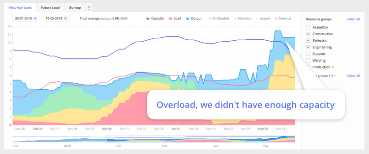
The next step after seeing that something’s wrong with the project is to look at the performance of the team involved in the projects that are trending up. Go to the historical load graph to see the relationship between capacity, output, and load. Your assumptions may have been wrong, and that’s why the project is trending up. Ask your team to comment on this because your employees may not even realize that something is wrong at the project level.
Figure 3. Historical load graph
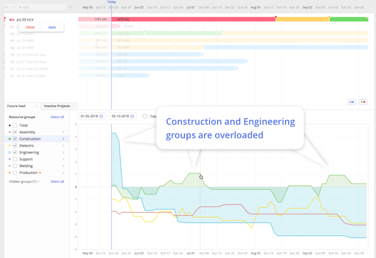
After checking historical load, we recommend that you take a look at the pipeline and future load.
Figure 4. The Pipeline and Future load graph.
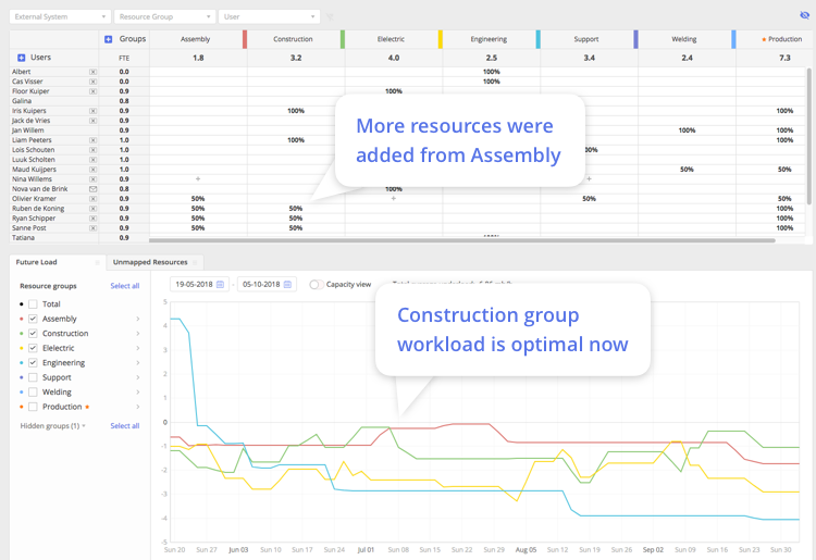
Possible fixes: Add more resources to the Construction group — re-train employees from the Assembly group.
Figure 5. Changes made in the Resource Management and their effect on the load of employees.
Get the Big Picture Without Asking
Our team has developed the only solution on the market that generates clear visibility across multiple projects on priorities, projects, and capacity. The focus on each provides you with both a detailed and high-level overview of your progress depending on what you need to see. With Epicflow you don’t have to ask your employees how everything is going and collect project information because you already see it on the screen.
Start making better business decisions based on real-time information.
Sign up below for an Epicflow live demonstration.