Workload Management Software
Historical Load Graph
Gain Essential Insights About Previous Resource Load and Performance to Boost Their Productivity in the Future with Workload Management Software
- Compare resources’ load, capacity, and output changes over time.
- Use historical data during overview sessions to discuss the historical output, define the causes of its decrease, and find ways to increase it.
- Balance your employees’ workload to avoid resource conflicts and bottlenecks in the future.
Historical Load graph is an essential feature of Epicflow that helps analyze your teams’ performance over time based on all projects in the Pipeline. This graph is vital for companies dealing with a multi-project environment with a shared resource pool.
With Epicflow workload management software, you always have access to historical data of completed and active projects that you can use to make predictions about their output in the future.
Components of the Historical Load Graph
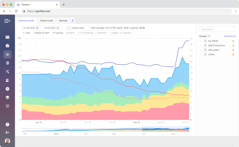
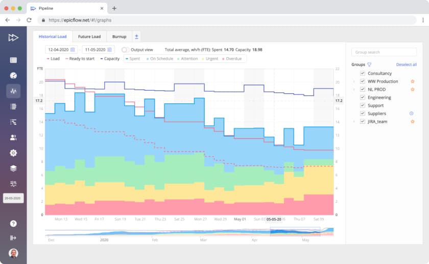
The graph has “Date” and “FTE” (Full-time equivalent) axes and presents historical information on all Resource groups.
You can see the following lines on the Historical Load graph:
- Load
- Ready to Start
- Capacity
- Output
The output is divided into several subgroups:
- On Schedule (Blue),
- Attention (Green),
- Urgent (Yellow), and
- Overdue (Urgent)
The color of the subgroup depends on the priority of the closed task, which indicates the urgency of the task at the moment of its accomplishment.


- The red line shows the historical workload in FTE for the selected team over time.
- The dotted red line is used for the tasks that are at the “ready to start” stage. In other words, it shows the workload caused by the tasks that have no blockers in the historical timeline. As compared to Load, it doesn’t include blocked tasks on the “Not ready to Start” and “Upcoming” stages.
- The blue line is used for capacity and indicates the expected team’s output based on the historical availability and working hours of each team member.
- The light-blue line presents team output in FTE.
 Boosted resource productivity
 Enhanced flows of multiple projects
 Improved estimations
 Better project results and business outcomes
Historical workload management tool provides much valuable information: use it to make a trend analysis over time to reveal things that are happening in your organization but aren’t visible at all levels. The result of the workload analysis with this graph is enhancing your resources’ productivity and improving your estimations based on the data from the past. As an effect, the flow of projects running at your company will be significantly upgraded and you will be able to reach your business goals faster and with less effort.
Transforming Workload Management Tool – Historical Load Graph’s Data into Crucial Project Information
Get essential information about your project environment with the Historical Load graph itself and other Epicflow features to increase your resources’ efficiency and decrease project delivery time.
To interpret the Historical Load graph correctly, remember the following rules:
If the output and capacity lines are not at the same level, your teams produce less than they are capable of doing. You should analyze all related data to understand why their output is lower than expected.
If the load line is higher than the output and capacity, your resource groups are overloaded. It is one of the possible reasons why your team’s output is lower than capacity.
If the “ready to start” line is lower than the load line, this is a bad sign. This means that your resources are idle and cannot start their work on time because of other resource groups who can't cope with their work.
Balancing load and capacity will help you achieve better output. The ideal scenario is when the output and capacity are equal.
Improve Your Resources’ Load and Output Analysis by Using Other Charts Together with the Best Workload Management Tool
- Use the insights gained with the help of the Historical Load graph to predict the resource demand with the Future Load graph.
- Track time and budget buffers on a Bubble graph when your projects are in progress to fight uncertainty.
- To make flawless project decisions and ensure the success of your initiatives, use AI-driven What-if analysis and then go to the Historical Load graph to check the load changes.


Get a Reliable Project and Resource Management Assistant Onboard with Epicflow Integrations
We’ve got ready-made integrations with Jira, Oracle Primavera, and MS Project, and our experts can develop any custom integration for your company to enrich your current software with powerful features that will let you effortlessly do complex data analysis and gain valuable insights for improved project and resource management.
At that, teams can keep working in their home-like environment with their current tools, while management will obtain not only advanced functionality for project, resource, and risk management but also full project transparency for profound data analysis.
Ready to See Epicflow in Action and Start Your Journey to Project and Resource Management Excellence?
Book a personalized demo now to learn more about Epicflow agile project portfolio management software and the ways it will help you organize processes at your company, improve team productivity, and manage your project portfolio – everything you need to achieve the desired business results with efficient project portfolio management!


