Burnup Chart: Be Aware of How Much Work Is Left
Examine your team’s progress on a project by comparing the amount of the completed and remaining work in terms of the approved budget.

Burnup Chart Interpretation
In Epicflow, we measure costs in working hours, which is 1 full-time equivalent. We use this indicator to simplify measurements as an FTE is a common benchmark used worldwide.
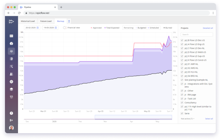
You can find the following data on the Burnup Chart:
- A red line shows the approved cost.
- A purple line shows the total expected cost – estimated project cost – that consists of budgeted and scheduled project costs.
- Budgeted cost is what we have in reserve.
- Scheduled is the cost that has been already assigned.
Detect Time Increments and Improve Your Project Outcomes
On the graph, you can see time increment in the past caused by scope creep or mistakes in estimates. Register the reason of increments on the date they occur and use this information for your lessons learned to improve management of your projects in the future.

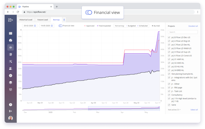
Financial View with Relevant Budget-Related Data upon Restricted Access
Use advanced settings to check the financial status of your projects and choose project team members to grant access to this data.