Multiple Project Dashboard: How to Set Up & Templates
 Mykhailo Kulakov
.
May 13, 2026
.
Project Management
.
25 mins READ
Mykhailo Kulakov
.
May 13, 2026
.
Project Management
.
25 mins READ
Managing multiple projects is a uniquely challenging task because on top of regular project management workflows, you need to manage interproject dependencies and ensure an optimal resource load. A project dashboard for multiple projects is a simple yet effective tool that lets you do that and provides a centralized source of project information.
In this guide, we’ll take a closer look at what a multiple project status dashboard is, how you can create one, and what are some of the challenges associated with creating and using one.
Key takeaways:
- A multiple project dashboard allows its users to quickly assess the state of the multi-project environment.
- It can be created with spreadsheets, project management tools, or portfolio management tools.
- A great dashboard should include data on all the relevant projects and resource groups, and allow for interactivity to transform it from data visualization to an analytical solution.
What Is a Multiple Project Dashboard?
A multiple project dashboard is a data visualization tool that can display all the relevant data about multiple projects you’re managing in one place. Typically, a multi-project dashboard includes data on project progress, project risks, and interconnectedness of projects.
Its purpose is to inform high-level decision makers, C-level executives and portfolio managers, of the overall progress of the projects undertaken by the company and to give project managers a way to report on the progress without creating custom reports.
Multiple project dashboards can be created in different media, from spreadsheets to specialized apps. The most important factor in creating an informative dashboard, regardless of the medium, is data integration and adding the right metrics to it.
Benefits of Using a Multiple Project Dashboard
Using dashboards for multiple projects can bring multiple strategic benefits. Let’s explore the most important ones.
Centralized cross-project visibility
The first and the most obvious effect of using a dashboard for multiple projects is achieving visibility across all projects. This allows the management to quickly view the progress on all projects in a single environment, which greatly improves understanding of all current project statuses and saves time on checking each project individually.
It also saves time for the project managers and team members, as it removes the need for reporting, replacing it with automatic project status updates.
Risk identification
Most project dashboard solutions include some form of risk identification. The main way project progress is presented is by comparing the assessment of time required to finish it with time already spent on the project. The closer the latter is to the former, the closer the project is to the finish line.
This data can also be used to indicate whether the project is at risk of going over the budget by comparing the current state to the approved budget.
This helps the management to spot projects that are at risk and take action before the issue compromises other projects.
Read More: Too Many Projects, Too Little Clarity: Portfolio Risk Management in Action
Resource optimization
The best multiple project tracking dashboards include insights from resource management software. This helps highlight possible resource conflicts that might be influencing different projects. These typically occur because too many projects are scheduled simultaneously and the workload exceeds the resource capacity of the company.
Visualizing projects and resource demands with a dashboard helps with resource optimization, which in turn can improve productivity across the company.
Improved decision making
All of the benefits above combined result in an improved ability to make decisions. Instead of basing project acceptance and resource allocation decisions on subjective opinions and scattered data, you can base them on real-world data presented by the dashboard.
This improvement in the decision-making process has a secondary benefit of being able to track what exactly went wrong if the decision made was wrong.
The Essential Elements of a Multiple Project Dashboard
A custom multiple project dashboard can be configured however you like. But overloading it with data visualizations can lead to it being difficult to read. Adding too little data points results in the dashboard being uninformative.
Here are several elements that should be included in most dashboards.
Project status overview
The first thing every project dashboard should contain is a way to view statuses of all of the projects added to it. This helps the dashboard to perform its main purpose, showing project progress across the program, the portfolio, or the collection of projects.
That can typically be done in several ways:
- A project health indicator that shows the number of projects that are on track to success or at risk.
- A pipeline view that shows projects across a large timeline.
- A fever chart that shows project progress against a time buffer.
Dependency tracking
Another important element of a multi project dashboard is tracking project dependencies. This means keeping track of both logical dependencies between connected projects and resource constraints. Typically, it’s done through a Gantt chart.
Resource capacity tracking
Since resource capacity is the primary constraint of project execution, dashboards need to show it to inform resource allocation and project planning decisions. Typically, it’s done via a load graph that shows how the load of assigned project tasks compares with resource capacity over time.
Risk identification
A good dashboard should have a way to indicate the level of risk a project is facing, typically in terms of risks of project delay or going over the budget. In most dashboards, this is realized either through a risk gauge or through highlighting projects in different colors.
The standard color scheme used across multiple tools and custom made dashboards is:
- Green means the project is on the right track.
- Yellow means the project is at risk.
- Red means the project is past due or over budget.
Interactivity
A great dashboard also allows its users to interact with the performance metrics displayed in it. It might not be possible in simpler dashboards created in spreadsheets, though. If your dashboard has this feature, it transforms it from a simple data visualization tool into a workload analytics tool.
You’ll be able to view specific projects and resource groups separately and narrow down the source of issues to a specific resource or task. This is important for solving multi-project management problems like resource conflicts and bottlenecks.
Where Can You Create a Multiple Project Dashboard?
A multiple project dashboard can be created in multiple ways: in spreadsheets, project management tools, or portfolio management software. Below, we’ll take a look at the pros and cons of each option .
| Spreadsheets | PM tools | PPM tools | |
| Pros | Affordable, endless customization options. | No need for data integration. | More opportunities for advanced analytics, resource management. |
| Cons | Can be difficult to set up. | Can lack resource management options. | Learning curve, less opportunities for customization. |
| Best for | Small number of projects. | Medium number of projects. | Complex dynamic multi-project environments. |
Multiple Project Dashboard Examples & Templates
To understand how your multi-project management efforts can benefit from a dashboard, let’s look at a couple of examples. The examples used are dashboards accessible through Epicflow. Epicflow is a multi-project resource management software that helps businesses visualize the state of all projects in their portfolio and make better management decisions.
Pipeline
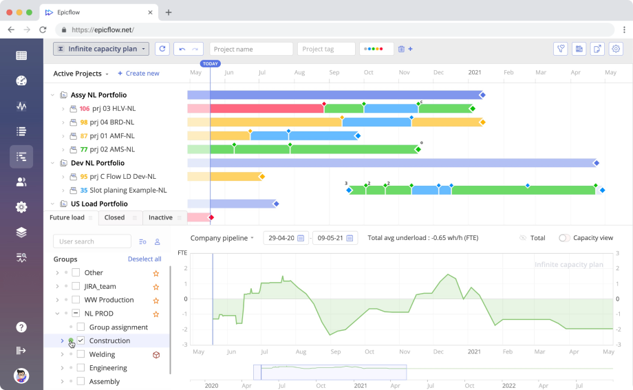
Project pipeline overview is the most common way to review project progress across the portfolio. It presents active projects as bars on the timeline broken down into project milestones. You can quickly gauge whether a project is on track to meet its goals by checking the color of the bar.
It also presents a load graph that allows you to check how loaded your resource pool is at the moment and future load projections. An ideal load graph should be slightly below zero, this means that project resources are optimally utilized.
You can use the pipeline overview dashboard to view specific projects or resource groups and check their progress and load metrics separately. This helps with finding out what overloads the company resources in case the company-wide load graph indicates an overload.
Project performance tab
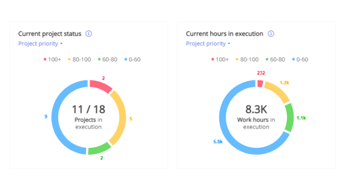
The project performance tab shows a quick overview of the state of projects in your portfolio. It shows how many projects are currently in execution, how many projects are delayed, and how many hours were spent so far. It provides enhanced cross-project visibility at a glance and improves the time it takes to react to issues that are forming in project execution.
Bubble graph
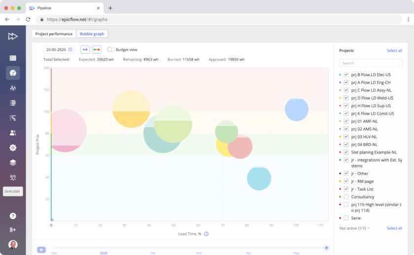
Bubble graph is an advanced fever chart that visualizes project progress in the form of bubbles sorted across two axes: lead time and project priority. It allows the user to quickly assess whether the projects displayed are on track to meet their due dates.
The budget view also allows you to see whether a project is estimated to be completed within budget by comparing budget burnup to project estimates.
How to Build a Multiple Project Dashboard with Epicflow: Step-by-Step
Building a multi-project dashboard with a specialized tool is pretty easy. Here is how you can do it with Epicflow.
Define data sources
The first step in the process is defining the data sources you’re going to use for the dashboard. You need to add data on:
- Project due date.
- Project budget assessment.
- Important project files.
- Task statuses.
- Resource capacity.
- Hours spent on tasks and projects.
To integrate all of these, you might need to use data from project management software and HR software to get a clear picture of resource capacity and project progress.
Define the scope
The next step is to define how many projects you need to add to Epicflow. Depending on your needs, you can add all projects in your portfolio or the ones you’re managing. It’s best to add as many projects as possible to be able to view project interdependencies.
For best results, import all the projects that are interrelated either in logical progress or by engaging the same resource pool.
Integrate data
Now, integrate your data sources with Epicflow. If you’re using Jira, Oracle, or MS Project, you can integrate them natively. If you’re using other tools, you can integrate them via API.
Add the projects and data points you need to analyze and set up automatic data export. This is important to save time on manual data entry.
Familiarize yourself with the dashboards
With all of the data integrated into the tool, you can start familiarizing yourself with it. Test all the Epicflow dashboards to see how they work.
Use the onboarding materials to learn more about the advanced uses of dashboards. Especially in the area of using them to find exact reasons for bottlenecks. Book a call with the Epicflow team to learn more about that process.
Read more: Tracking Performance: Switching from Project to Resource Level
Monitor performance and improve
From there on, use the dashboards to monitor performance of your projects, find bottlenecks, and resolve them.
Common Mistakes in Multiple Project Dashboards
Creating an effective multiple project dashboard is not an easy process. Here are the main challenges that you may run into when creating it.
Siloed project data
The effectiveness of tracking progress of multiple projects depends on the quality of data you provide. A common problem that plagues many companies is project data being siloed between departments, teams, and individuals. This includes data on project requirements and time spent on executing the project.
More importantly, though, this issue includes scattered data on the projects the resource pool is engaged in. Not uploading all projects that a particular group of resources is tasked with can result in skewed resource usage analytics in the dashboard.
Lack of automation
The quality of data integration also relies on automatic updates. If the imports are not made to run on a schedule, it will result in wasted time spent on importing data manually.
Poor dashboard layout
Custom dashboards provide a lot of freedom in terms of how data is visualized. But if you don’t have the skills in creating dashboards, this freedom can lead to a suboptimal layout that will prevent you from getting insights. A poor layout can be either cluttered with data, which prevents from finding the important information fast, or lacking core metrics.
This issue is only present in dashboards that you have to build from scratch, like ones created in spreadsheets. Most pre-built dashboards like Epicflow provide some level of customization while keeping the core structure informative.
Lack of interactivity
A dashboard that only visualizes data but does not allow any interactivity can only serve as a quick way to view progress of multiple projects. An interactive one can be more than that: it can serve as an analytical tool that can help you find problematic places in the portfolio and fix them.
Lack of skills in using the dashboard
Finally, the lack of analytical skills of the user can prevent them from using the full potential of a great dashboard. For high-ranking management, simply checking on project progress may be enough, but if you need to be using the dashboard you’ve created as an analytical tool, you need to learn advanced usage practices.
Final Thoughts
A good multiple project management dashboard can help you visualize progress across all of the projects you’re managing and serve as a reporting tool for higher management. A great one can serve as an analytical tool that lets you find the problematic areas in the project timeline and resolve them.
To use a multi-project dashboard effectively, you need to ensure full data integration and upgrade the skills of using the platform you’ve chosen.
Frequently Asked Questions
What is the purpose of a multiple project dashboard?
The purpose of a multi-project dashboard is to quickly gauge the progress of all projects in your portfolio for planning, management, and reporting purposes. A good dashboard also allows you to interact with it by filtering the view to narrow down portfolio-wide performance issues to a single project or resource group.
Who should use a multiple project dashboard?
A multiple project dashboard is an important instrument for all managers who manage more than one project simultaneously. It allows them to understand project interdependencies and schedule projects in a way that maximizes productivity and business value creation.
Why does managing multiple projects without a dashboard fail?
Without a dashboard, a project manager will spend most of their time on getting individual reports from different project teams and struggling to put them all together to form a clear high-level picture. A dashboard solves that problem by providing a centralized data visualization solution.
What metrics should be included?
The metrics you include in the dashboard depend on your goals and project issues you’re trying to resolve. The most important ones that should probably be included in most are resource capacity, resource load, budget burnup, and schedule variance.
How do executives use portfolio dashboards?
Higher management benefits from the dashboards being a centralized data visualization solution.
How does a multiple project dashboard differ from single-project tracking tools?
Single-project tracking tools only provide insight into the progress of a single project. If you’re managing multiple ones, you’ll need to check each project separately. Multiple project dashboards allow managers to view progress of all projects simultaneously and to view project interdependencies.
How quickly can a team implement an effective multiple project dashboard?
The speed of implementation of a dashboard depends on the medium you’re using. If you’re creating a dashboard in spreadsheets or an app that requires you to build a dashboard from scratch, it might take a week or two. If you’re using a ready-made dashboard, you can implement it within a day by simply integrating all the relevant data.
What is the best way to organize process tracking for multiple projects?
The best way to do this is to use a dashboard that presents all the relevant data on project progress and resource capacity.